My Work
1.
Landing Page Redesign
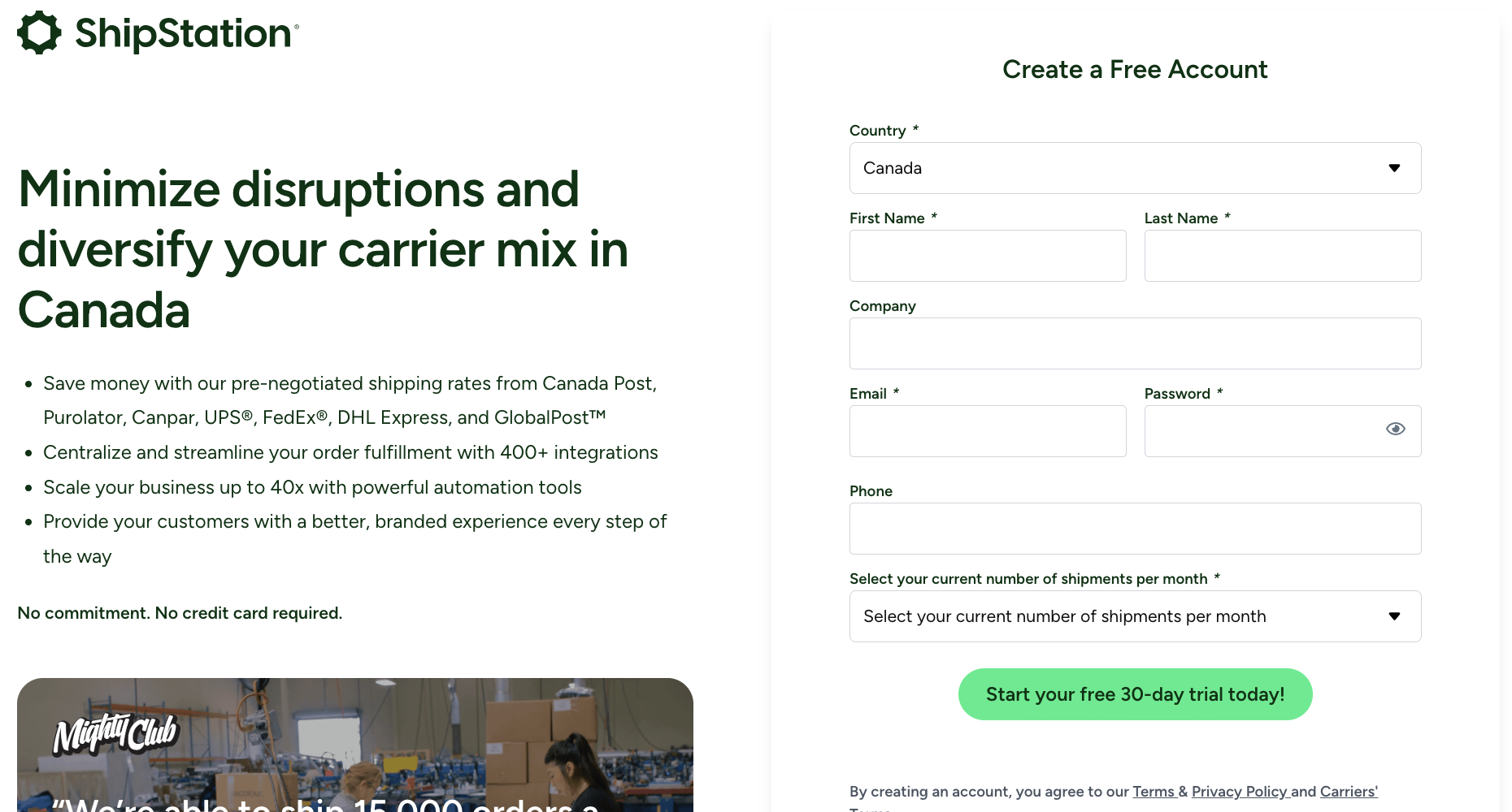
ShipStation (2025)
Revamping a company’s existing website using modern UI/UX practices
Role: Lead Designer (Art Direction, UI/UX Design)

Overview
In this self-directed exercise, I set out to modernize an outdated company website with a fresh, forward-thinking design. Many leading shipping companies now emphasize innovation and technology through visuals like sleek dashboards, data-driven interfaces, and isometric illustrations. My redesign draws inspiration from these trends to reflect a more progressive and tech-savvy brand identity.
The Challenge
The company’s existing website is functional, but lacks visual interest. It doesn’t do much to engage the user or generate excitement. The content relies heavily on telling rather than showing: it mentions integrations and automation tools but offers little visual or interactive context to help users understand their value or impact.
Website (Before) - Screenshots
Pain Points
Outdated Design
The page lacks visual impact and doesn’t immediately capture the user’s attention. It’s missing engaging elements like photos and graphics that help showcase the product and how it works. Overall, both the design and content feel dated compared to the sleek, tech-forward standards of modern shipping companies.
Style Cohesion
The call to action color is not in line with the company’s brand guidelines. The page margins are inconsistent. Without a clear information hierarchy, the layout is cluttered and difficult to follow. These issues combine to create a disjointed experience that makes the page less enjoyable to navigate.
Solution
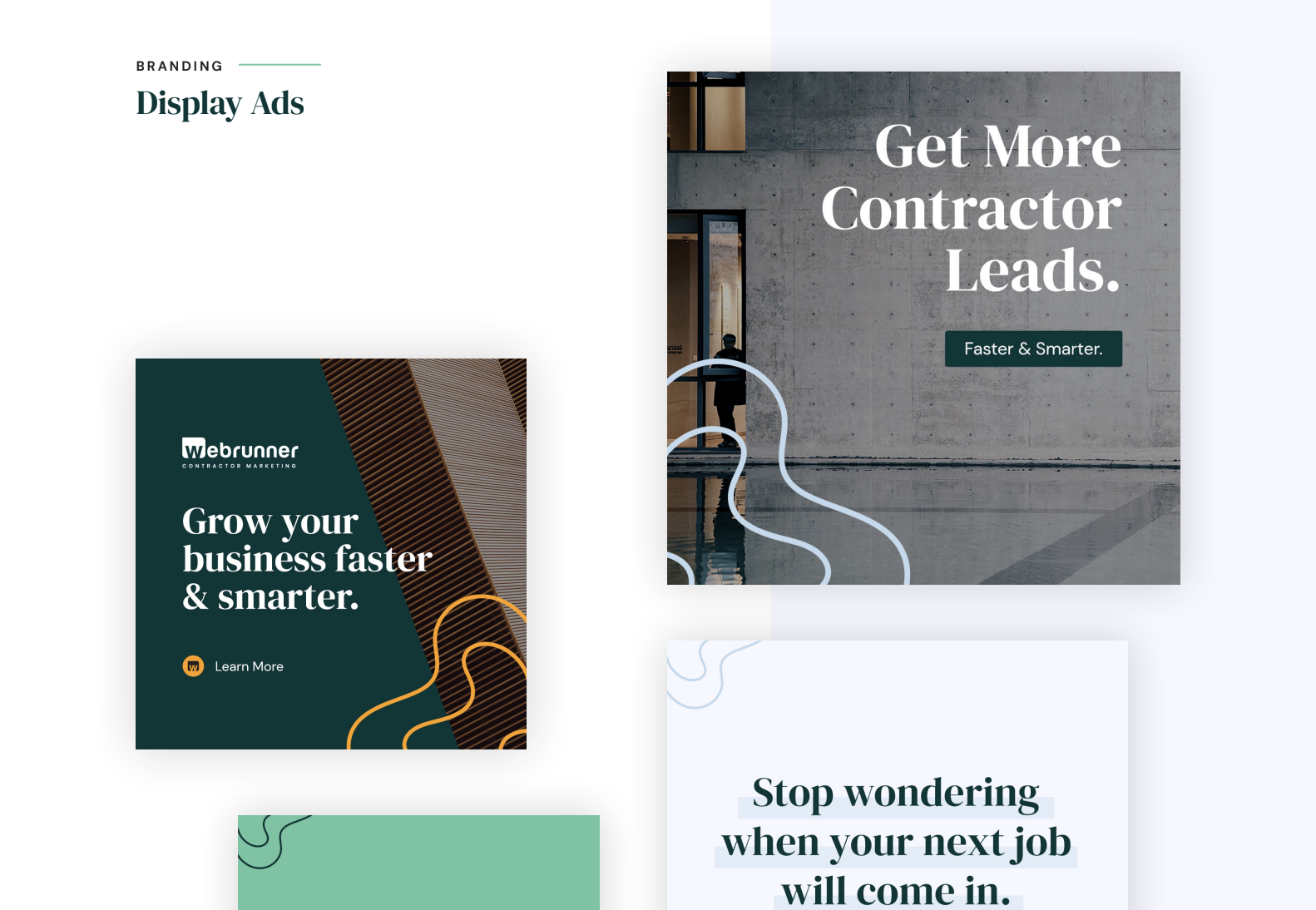
I wanted to make the page easier to navigate and more intuitive, so I added a sticky navigation bar with quick links to each section. I also restructured the content with clear subheadings and a consistent hierarchy, making it easier for visitors to scan and find what they’re looking for. To elevate the brand’s tone, I used confident, forward-focused words like “smarter,” “unmatched,” and “advanced” to imply an elevated level of service from the company. Finally, I introduced visuals such as customer dashboards and modern isometric illustrations to give the design that polished, tech-driven look seen in today’s leading corporate websites. Overall, the redesign modernized the experience, aligning the company’s digital presence with the sophistication of its service offering.
2.
Landing Page
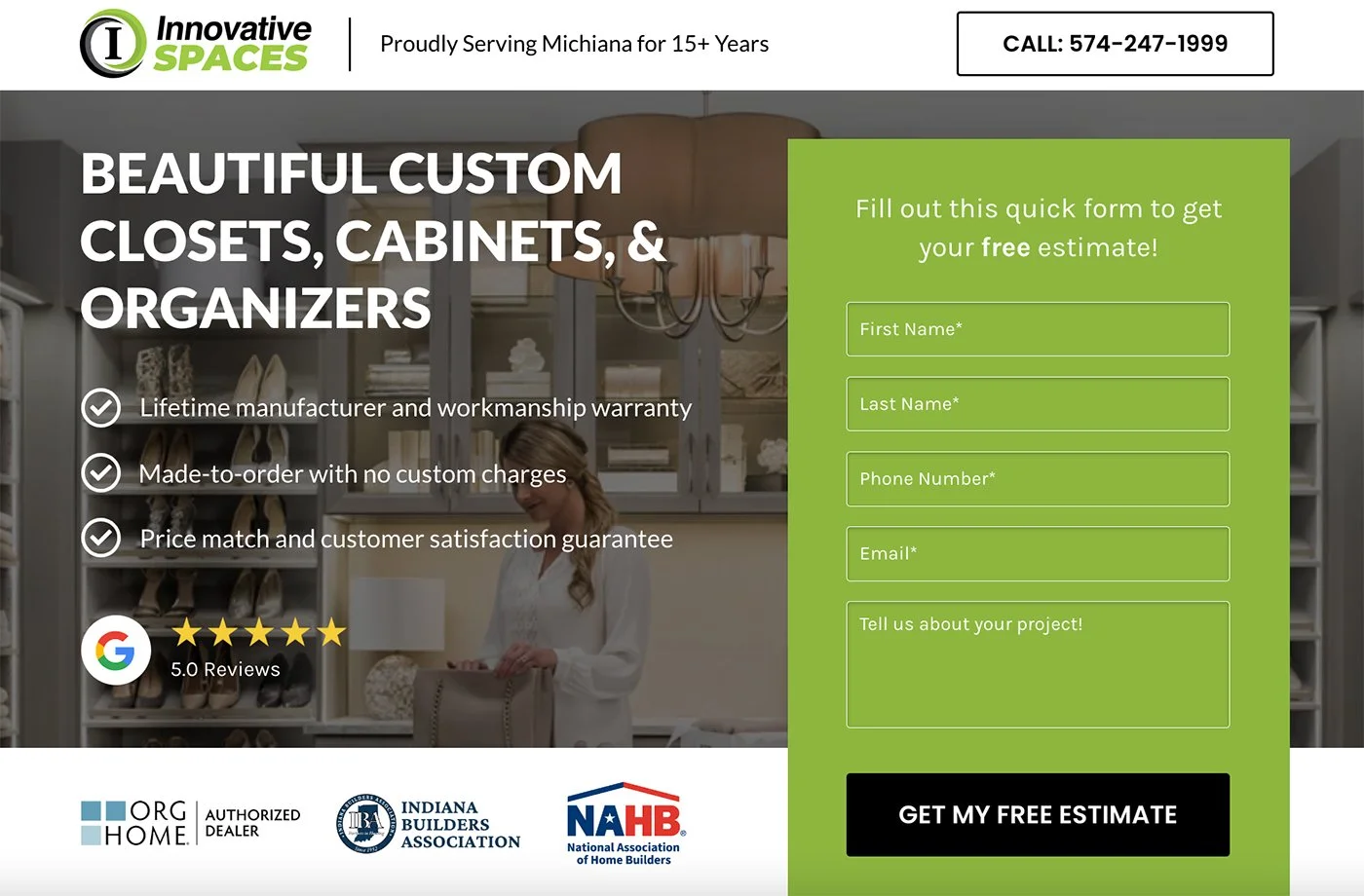
Home Improvement Company (2023)
Creating a lead-generating landing page for a paid ads campaign
Role: Lead Designer (Art Direction, UI/UX Design)
Overview
In this project, I created a landing page for an Indiana-based home improvement company. The goal was to create a compelling, high-converting landing page for users who would land on the page when they clicked on the company’s paid ads on Facebook and Google. As a conversion designer at a digital marketing agency, this is one of many clients that I’ve made landing pages for. However, I am particularly proud of my execution on this project, as I worked hard to leverage the business’ unique selling points to create a stylish, lead-generating landing page.
The Challenge
The client’s existing website needed some work. While very informative, the site is text-heavy and inconsistent. There is no clear type hierarchy and some sections contain large empty spaces. These features can create a sense of confusion and disorientation for the user.
Website (Before) - Screenshots
Pain Points
Simplify
The goal for a landing page is to convert visitors to leads using eye-catching visuals and enticing offers and services. In order to create a positive experience for the user, I needed to distill the vast amount of information to present the unique selling points to the user.
Organize
The existing website is lacking a clear hierarchy. Making defined sections for products, galleries, reviews, and more will help the site flow and create a much more enjoyable experience for the user.
Solution
The hero section is the first thing a customer will see when they click through the targeted ads, so I needed to make it concise and engaging. I prioritized the service in the main headline and highlighted the unique selling points in bullet form. For the hero image, I used one of the many nice lifestyle photos provided by the company’s manufacturer, adding a dark overlay to ensure the text remained legible. I used the company’s bright green colour to highlight the contact form. The CTAs are responsive, as they change colour when hovered over, as is the header, which sticks to the top of page as the user scrolls. Further down, I showcased some of the company’s social proof to establish legitimacy. With its concise copy, bold contrasting colours, responsive design, and marks of experience, the hero section conveys high-quality, professional work.

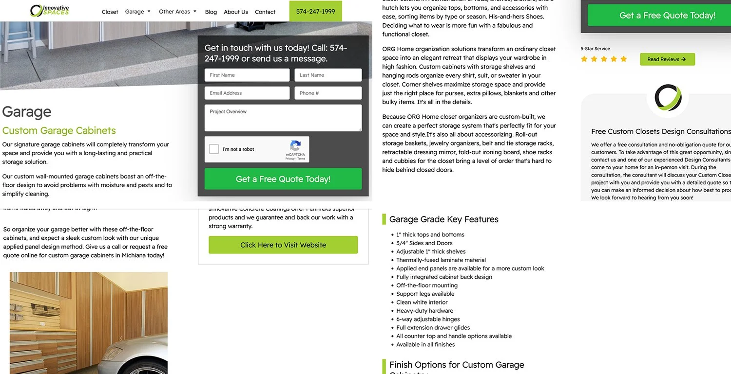
Website (After) - Why Choose Innovative
I applied the same principles used in designing the hero section to the subsequent sections. In the “Why Choose Innovative” section, there is a clear heading and subheading in use, a format that repeats throughout the page to define the different sections. I expand on the main selling points used in the hero section’s bullet list, putting them front and centre, accompanying them with icons to emphasize their features, and putting them on white boxes to stand out against the darker background. The descriptions are extensive but to-the-point, providing the user with as much value as possible within the condensed space.

Website (After) - Excerpts
I’m happy to say this account is performing well, exceeding standard industry conversion rates and even exceeding the higher conversion rate goals the agency sets for itself. I credit my fantastic colleagues for tirelessly working to optimize the company’s search ranking, as well as my own ability to understand the company’s digital presence and reconfigure them to create an exciting, engaging user experience.
3.
Logo + Icon + App Mockup + Sales One-Pager / Presentation Slide
Boomerang (2022)
Creating a brand identity for a marketing agency’s new platform
Role: Lead Designer (Art Direction, UI/UX Design)

Overview
In this project, I designed a logo and brand identity for Boomerang, a white-label lead capturing platform acquired by my employer, a digital marketing agency. The platform’s brand needed to align with that of the agency in order to present clients with a cohesive package. Through this task, I learned to innovate and expand on existing brand guidelines to develop the identity of the agency’s new venture, solidifying their overall brand in the process.
The Challenge
For this project, the agency presented me with the following brief:
We've acquired a new white-labeled software solution that we can tailor and introduce to our customers. We've decided to come up with a new name for the application (Boomerang) and would like to build a few brand assets we can leverage to bring this software to market. Since this is a product we'll be reselling, we want the new brand to follow Webrunner's existing style guide. In fact, we'd probably consider adding "by Webrunner" to the logo.
Name: Boomerang (by Webrunner)
Tag Line: Messaging Solutions for Modern Day Contractors
Preferred File Types: PSD / AI + PNG (logo) + PDF (mockups)
To create a winning design, I needed to expand on the company’s existing brand guidelines to extend cohesive brand identity to all of the agency’s platforms.
Webrunner - Style Guide (excerpt)
Pain Points
Follow the agency’s existing style guide.
The agency has clearly put a lot of thought into their brand. They utilize bold fonts, soft colors, and minimalist geometric shapes across their sales decks, merchandise, and other marketing assets. They provided links to their thoughtfully-organized asset folders and brand guidelines. I knew I needed to respect the existing guidelines to earn design approval.
Create within confines.
With such strongly defined branding, I knew I needed to create within those confines - no sharp edged geometric shapes, since their shapes are more rounded and soft; no harsh colours, since they opt for softer blues, greens, and yellows.
Solution
For the logo, I started off simple, typing out “Boomerang” using the agency’s headline font, DM Serif Display, and their dark green color. It didn’t look too bad, but I wanted to offset the abundance of round shapes in the first half of the word, as I felt the “B” and the two “o”s made the latter part of the word look small and uneven. I knew I wanted to incorporate a “boomerang” shape somewhere, so I thought it could fit in nicely in this end. I created the boomerang illustration, keeping it simple and with rounded corners to fit with the agency’s other illustrations, and experimented with different sizes and angles before settling on the final orientation. The finally orientation has one arm of the “boomerang” parallel with the type, and the other arm points on an upward trajectory, signalling progress and success.
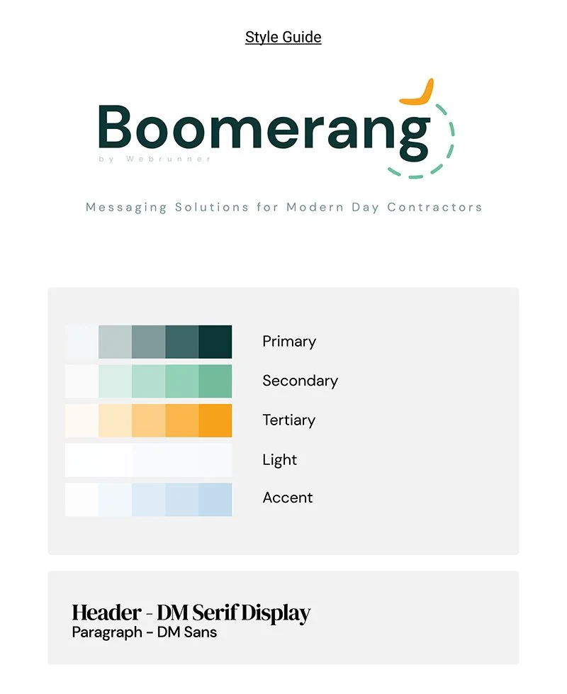
Boomerang - Style Guide
I felt the design was almost complete, but I wanted to imbue the design with a sense of motion. Boomerang’s purpose is for contractors to follow up with leads through a series of automations after the initial form submission to convert those leads to sales. The lead will see an ad, submit their info, and presumably go on with their lives, but the series of automated reminders and follow-ups (texts, emails, etc) will eventually circle the lead back to the contractor (thus the name “Boomerang”). To create this sense of motion, I added a dashed line trailing the boomerang illustration. While the agency mostly uses wavy lines in their designs, I opted for a circle to mimic the movement of a boomerang and to symbolize the platform’s cyclical targeting of leads. The line further helped balance the discrepancy in roundness I previously described, and emulated a loading screen pinwheel, emphasizing the platform’s goal of progress in the digital sphere. Satisfied with the layout, I moved on to colours.
I experimented with the agency’s color scheme before landing on the final iteration. I liked the bold yellow color for the boomerang illustration, as its gold-ish hue highlighted the illustration and symbolized value. I opted for a light blue color for the motion path, so as to not take way from the bold green and yellow used and to establish some of the airiness that appears in the agency’s other designs.
I’m proud to say my design was picked and appears across the platform, in sales decks, at trade shows, and more. I credit my success to my ability to adhere to instructions and my creative ability to expand on existing guidelines to create meaningful, professional designs.

Boomerang - Dashboard Mockup
4.
Case Study
Lucca Sunglasses (2021)
Creating a simple and intuitive eCommerce site (desktop and mobile)
Role: Project Manager (Art Direction, UI/UX Design)
Overview
In this project, I designed an eCommerce site for Lucca Sunglasses, a fictional women’s sunglasses brand. I created this case study to practice my design skills and to immerse myself in a given user’s perspective, learn their needs and pain points, and cater a site’s design to meet their goals and facilitate a successful conversion. This practice in design and user empathy allowed me to apply and develop my skills in a realistic setting, preparing me to build better projects in the future.
The Challenge
For this project, my target user was represented by Ruby.
Ruby is in her early thirties and lives with friends. She has a master’s degree and works in a small team. Ruby lives in Halifax, has never bought anything like the product before, and is not very tech literate.
To facilitate a successful conversion, I needed to curate the website’s design to compliment Ruby’s characteristics.
Pain Points
Don’t be too technical.
Ruby is not very tech-savvy, therefore I needed to maintain a simple, intuitive design. Other sunglasses sites possess long, scrolling homepages with small print and dozens of cards, which could overwhelm my user and discourage them from purchasing the product. I opted for a simple landing page where the user can easily identify and click to their desired section.
Emphasize inclusivity.
Ruby lives with friends and works in a small team, which could mean she values collectivism and community. I wanted to emphasize the communal aspects of the product in its presentation in an effort to rouse her interest. Some competing companies promote narrow definitions of beauty in their marketing, which could conflict with Ruby’s values and prevent her from identifying with the brand. To combat this, I needed to promote inclusivity in my messaging and design.
Earn user’s trust.
Ruby has a master’s degree and has never bought anything like the product before. By being highly educated but unfamiliar with the brand, Ruby may be hesitant to purchase anything without learning more about the company’s reputation and business practices. I needed to provide a level of brand transparency in my design in order to win Ruby over.
Solution
To begin, I created a simple mockup in Figma to model user flow through different pages (homepage, product features, checkout, purchase confirmation). To confirm that this felt right, I tested the flow on my phone. Once I was satisfied with the interactions and overall flow, I moved ahead with creating a hi-fi prototype.

Lo-fi prototype demonstrating user flow
In designing my hi-fi prototype, I had to consider the limitations imposed by my persona. I knew I had to design a simple, responsive interface that would be easy to navigate for someone who isn’t very tech-savvy. I had to highlight the community aspects of the brand in order to resonate with the persona’s collectivist values. I had to be concise in my presentation of the product, as the persona’s unfamiliarity with both the product and technology required a simple and low-stress experience.
Simple, intuitive design
Ruby is not very tech literate. I addressed this by trying to create an intuitive, responsive design. The buttons change color when hovered over, as do the cards on the homepage for user account, product features, and reviews, indicating their “clickability” to the user. On the Product Features page, links enlarge when hovered over, and when clicked, scroll to their corresponding sections further down the page. The page layouts are clutter-free and confirmation messages for password resets, purchases, and account registrations are succinct.
Inclusive branding
I emphasized community by selecting a diverse cast of models in hopes of resonating with Ruby’s value of inclusivity. I created a pop-up newsletter signup which emphasizes the network of customers as a family. Additionally, I made the review page immediately available on the homepage. This placement is doubly effective, as Ruby values community and is new to the product, increasing the odds that she will rely on the advice of her fellow shoppers when making a purchase. By curating the page design to Ruby’s traits, there is a greater chance of a successful conversion.
Transparent operations
To earn Ruby’s trust, I made the review page and product features page immediately available on the homepage. She can quickly see what others have said about their experiences with the product, as well as read information about the product itself. The page’s responsive design directs attention to these sections. When the user hovers over them with their mouse, the images darken, inducing clicks.
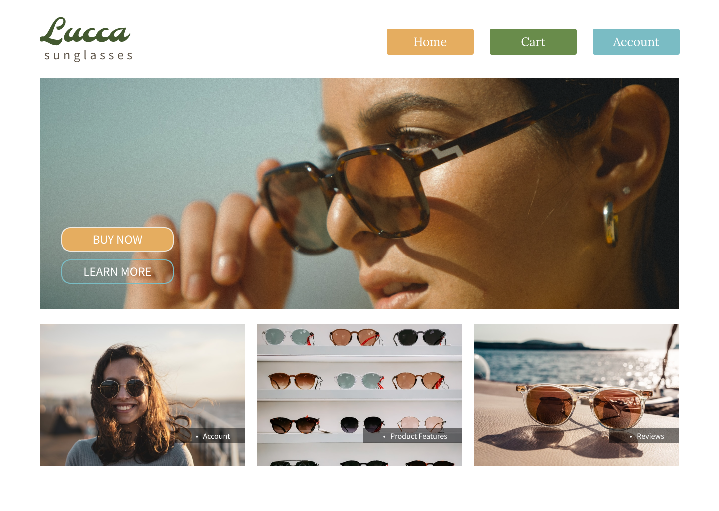
Final Prototypes
High-fidelity prototype (desktop)
High-fidelity prototype (mobile)
5.
Case Study
Alexandra’s Pizza (2021)
Redesigning and optimizing an existing company’s brand and eCommerce site
Role: Project Manager (Art Direction, UI/UX Design)
Overview
In this project, I completed a redesign of an existing company’s brand and eCommerce site. This case study challenged me to identify shortcomings within an existing design and find solutions that were innovative yet in line with the client’s original vision. Drawing inspiration from various sources, I developed a modern, responsive design that produces a favorable experience for the user and reasserts the company’s relevance.
The Challenge
For this project, the brand’s existing website was in serious need of a redesign. The layout was inconsistent, the style was dated, and the site was not particularly responsive. The page did not reflect a quality product. I wanted to preserve the company’s identity and story but reintroduce it with a modern design consistent with contemporary restaurant branding practices.


Pain Points
Dated style.
The website’s aesthetic is quite dated. The colors, photos, and fonts are generic and do not convey a strong brand identity. This bland palette could disinterest the user and discourage them from proceeding with a purchase. I needed to instill the brand with a more modern style.
Inconsistent layout.
In the original design, the website is disjointed. The navigation bars vary between pages, only showing the food menu upon a location selection. While this choice makes sense so as to prevent users from ordering from locations not near them, the navigation bar should still appear the same across all pages. The inconsistent design undermines the legitimacy of the business. Another issue with user flow and sequencing appears within the menus themselves. When clicking through the food menu, the items appear without any clear order and many items lack pictures. Expecting users to order items sight unseen could be risky, and may deter purchases.
Lack of responsive design.
My target user widely varies. I want the site to be easy to navigate for all. One of the best ways to direct user flow is responsive design. I want users to be able to interact with images and buttons so they can be more sure of where they are navigating and what they are selecting. Additionally, responsive design is a staple of modern web design and contributes to creating a more current style. There is some semblance of responsive design in the original page, but I wanted to implement more of this to gain more of the user’s trust and to create a more dynamic webpage.
Solution
I knew I had to update the style, streamline the user flow, and create more interactive components to create a more engaging and enjoyable experience. To do this, I assembled a strong, eye-catching design guideline, centralized and consolidated user flows, and created responsive components that behave the same across all pages. Combined, these alterations create a more consistent and comfortable experience for the user.
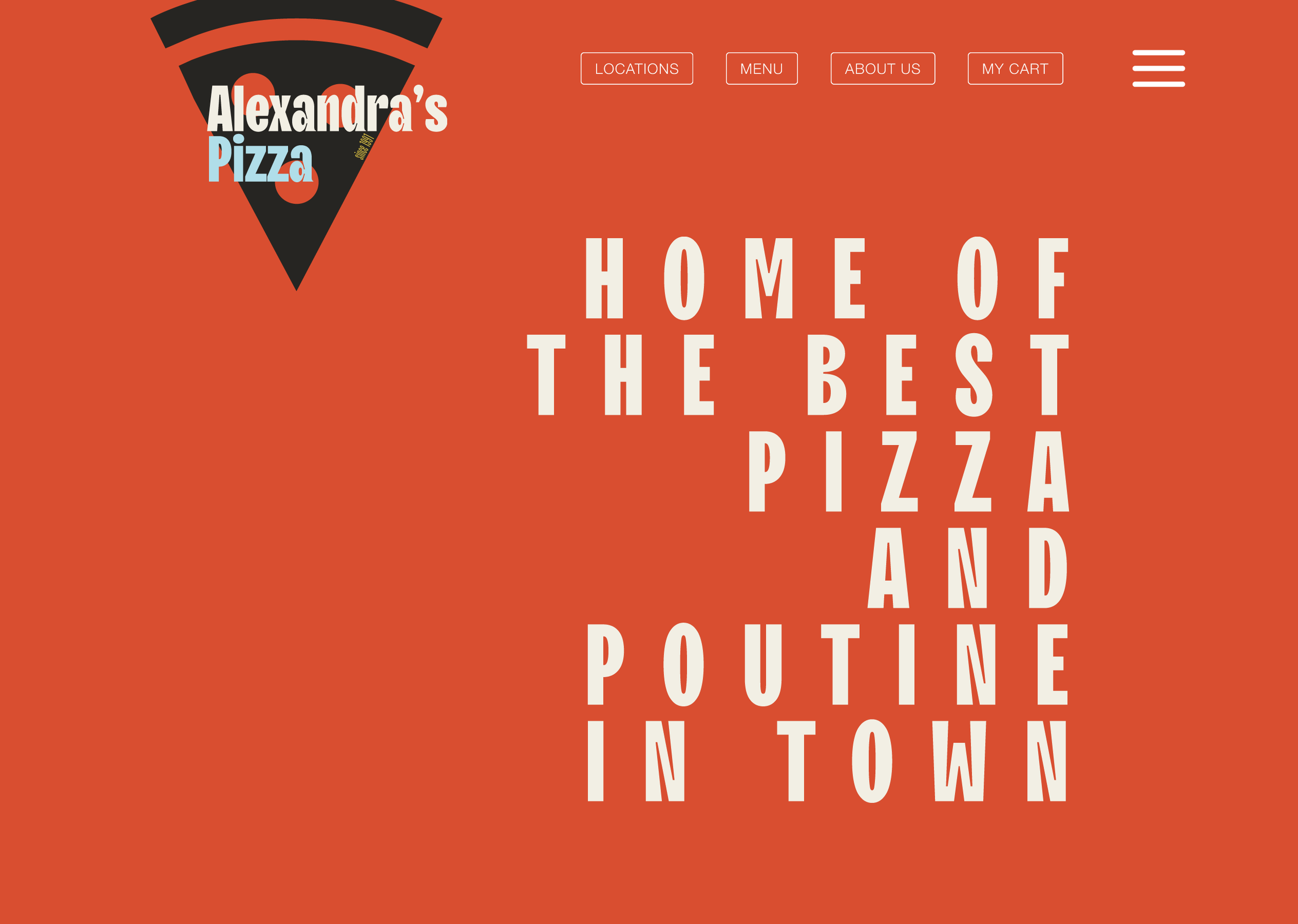
Lively, colorful style


The original website lacked distinct fonts for headings and paragraph text and did not strongly implement a color scheme. I sought to carve out a loud, stand-out style guide to present the brand in a more confident light. I took inspiration from numerous sources. I used old Italian film posters and advertisements from the mid-20th century as the basis for the colors and font choices. Old ads for Martini and San Pellegrino use bold fonts and bright colors, and I wanted to channel this same energy in my style guide. Imbuing the brand with this vintage style conveys a degree of Italian authenticity and personality, helping legitimize the company’s product. In combination with sleek, responsive website design, the website conveys a classic, time-tested product with a stylish, modern twist.
Consistent, organized flow
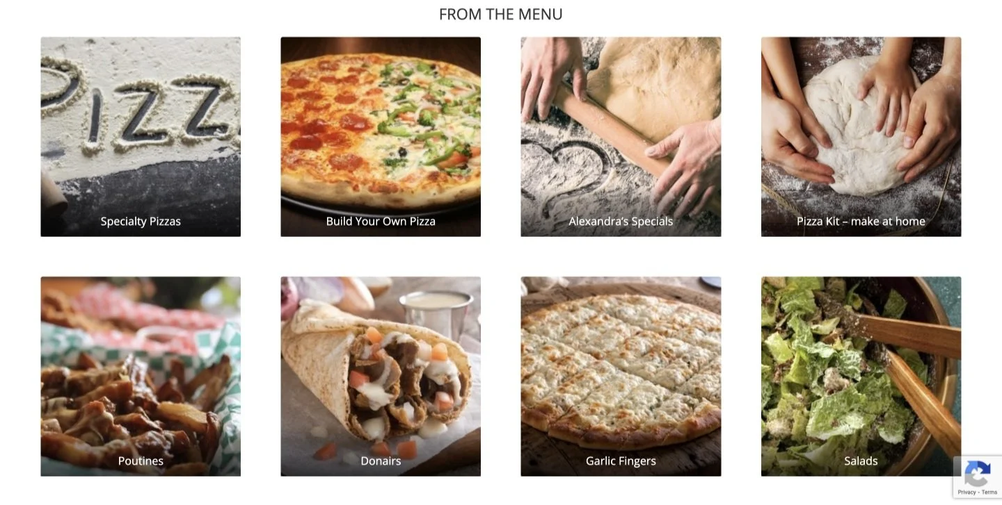
To address the inconsistent navigation bar, I created a “central” food menu that displays global items, such as the company’s specials and the “build-your-own” option. Upon selecting a global item, the user is prompted to continue to the check-out or continue looking at items available at their closest location. This alteration limits user confusion/disappointment from trying to order something not available at a particular location while maintaining a consistent navigation bar.
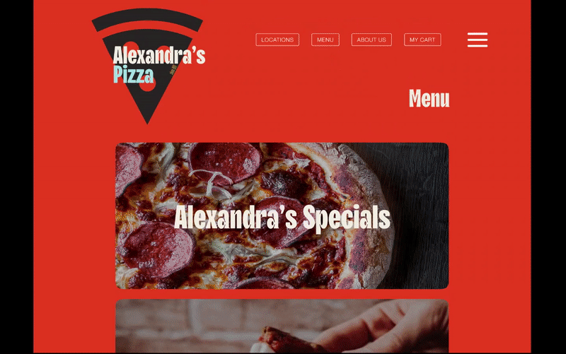
“Central” food menu - demonstration
To address the issue within the food menus, I created a design that better organized item variants. I redesigned the poutine menu as an example. In the original design, the poutines are separated into two different pages - one for small poutines and one for large. There is only one photo per page with no photos for any of the non-Original poutine options. Only having photos for the Original (the cheapest option) could deter users from purchasing the other, more expensive options.
In my design, I consolidated the small and large sites into one and sourced photos for all item variants. I made the “add to cart” buttons responsive, as well as the item photos which, when hovered over, reveal descriptions of the items. With my adjustments, users can better visualize their order and are more aware of the item variants available. Improving visibility limits confusion, thereby increasing the odds of conversion.
Poutine Menu Redesign
Responsive design
In my design, I increased the number of responsive objects. Buttons change color when hovered over, as do many of the images. I added animations to the logos and text when the user clicks on a new page, giving the impression of a more sophisticated system than the original. Responsive design is one of the hallmarks of contemporary web design. Incorporating this trend in the website gives users the impression of a current, successful business. Modernizing the style and layout of the website reasserts the company’s place in its market.